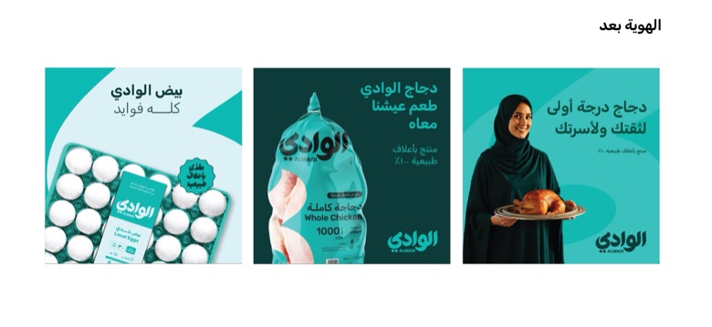
Alwadi
Fifty years, drawn by hand
CreditA collaboration with SERB, who brought me in as Senior Art Director. I led the art direction, built the visual identity and designed the full packaging range. Ehab El-Hamzawy designed the logo, and the SERB team carried the rest of the rollout.
The story
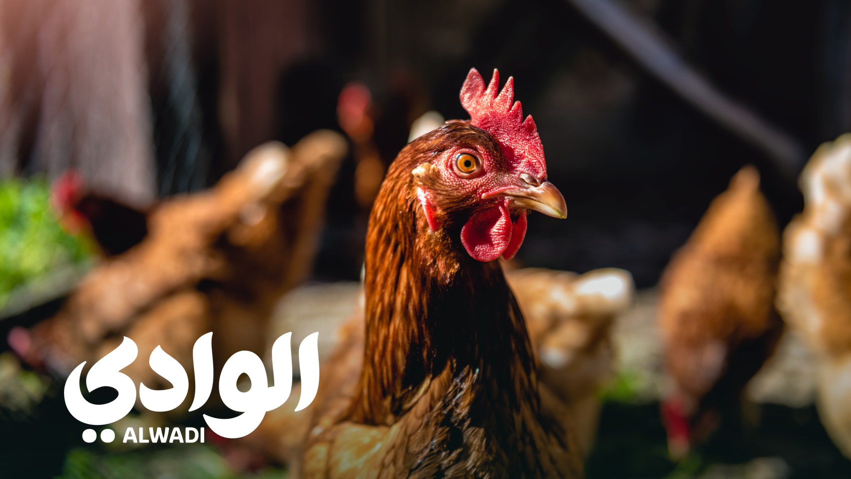
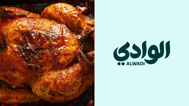
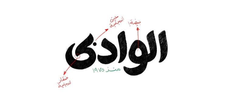
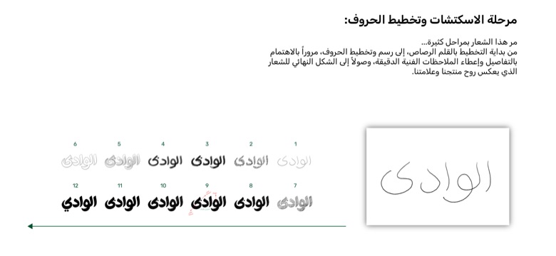
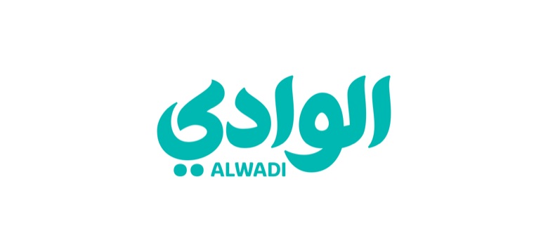
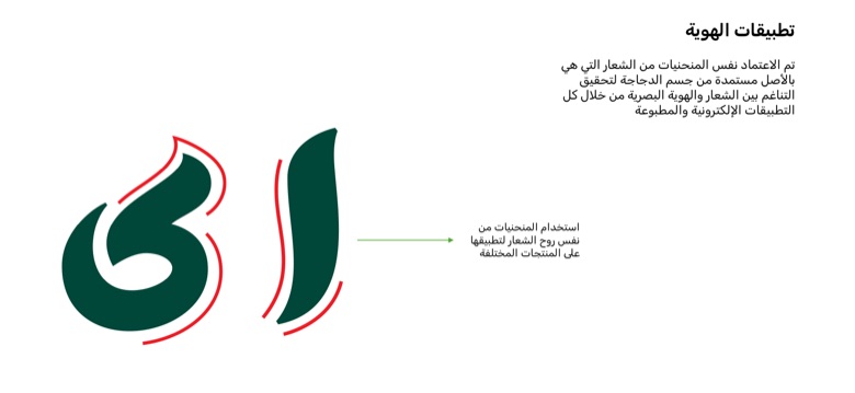
Al Wadi has fed Saudi homes since 1975, but the brand on the shelf had stopped saying so. The rebrand starts with the word itself. الوادي is a valley, and the letters were drawn by hand until the curves came from the brand rather than from a typeface: the eye of the ya reads as an egg, its tail as a beak. Those same curves then set everything that followed, so the white cut across every pack resolves into the head of a chicken.
Draw the word first. Everything else follows its curves.
Result
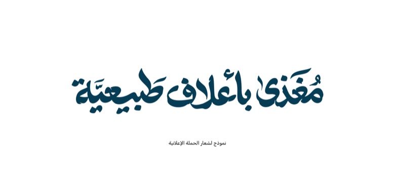
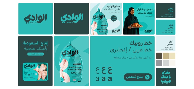
A full identity: logo system and lockups, colour, Arabic type, the complete packaging range, display fridges, campaign lettering and the online store.
Fifty years
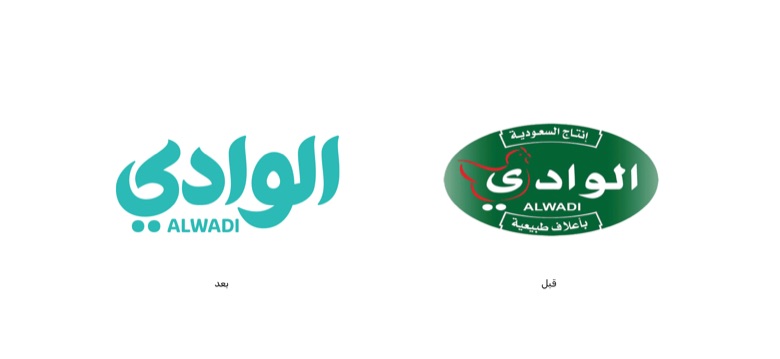
Al Wadi has fed Saudi homes since 1975. The problem was not that the brand was old. It was that the shelf had stopped saying so.
The rebrand had to put that back without throwing away what people already recognised.
The pack
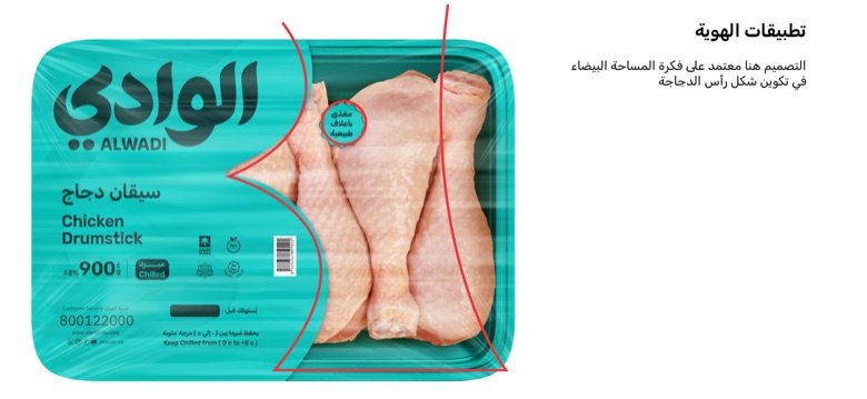
The white cut across every pack resolves into the head of a chicken, built from the same curves as the word.
The pack is not carrying the logo. At the size of a shelf, the pack is the logo.
Cut from the letter
The head of the chicken is the ya at the end of الوادي. On the chicken packs that letter is cut out of the colour, so the meat itself shows through the shape of it.
Two things happen at once: you see the product is fresh before you read a word, and what you are looking through is the brand.
Different packs, one rule
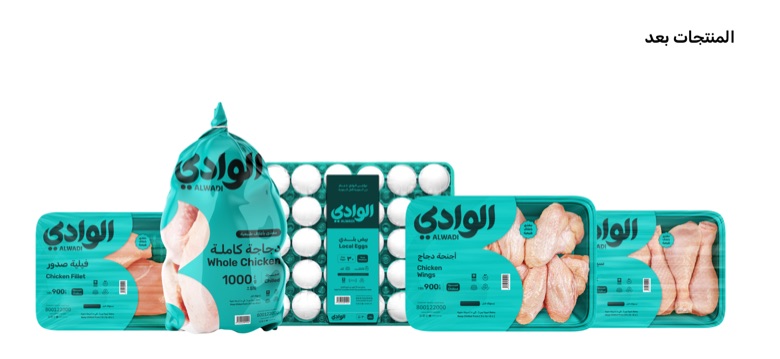
A whole-chicken bag, a fillet tray, a wings tray and an egg tray are four different objects. A layout that works on one of them falls apart on the next.
So the system is not a layout. It is a cut taken from the letterforms, and it reshapes itself to whatever pack it lands on.
The turquoise
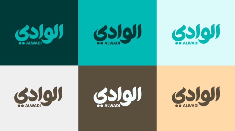
The category crowds around the same colours, so the range moved to a turquoise of its own.
It holds on an open shelf and inside a chilled cabinet alike, which is where this range is actually met.
Everything after
Logo system and lockups, colour, the Arabic type, the full packaging range, display fridges, campaign lettering and the online store.
One rule held it together: draw the word first, and let everything follow its curves.